What are you looking for?
Need help?
243 309 770
935 000 770
2ª a 6ª feira das
09 às 12h30   .   14h às 18h30

Sábado das 09 às 13h

The influence of colors we environment

cores-capa

conforto e cores

Colors are part of our lives and have functions that go far beyond effecting or transforming built spaces. The matrix differences tone and intensity are resources capable of transmitting unique messages to those who observe them.


what the techs say

In order to obtain a harmonious environment, it is important to know the circle and the order of the different tones. In addition to primary, secondary and tertiary colors, there is another essential category in the work of architects: neutral colors. This group is comprised of shades such as white, beige, gray, black and brown.


For designer Frank H. Mahnke, the colors of an architectural space are more than just decoration. In his book Color Environment and Human Response, the author states that the human brain processes shades from an objective basis.

This statement seems to be in line with color psychology studies, which explain how people identify and transform different shades into sensations.


cores


cores 2

color wheel


It's hard to find anyone who hasn't heard of the color wheel in architecture. Essential in this and other areas such as design e interior decor, this tool allows you to select a specific color and find other shades that match the one chosen at the beginning, allowing you to take full advantage of colors in the composition of environments.


mae e filha

the power of color


Did you know that each hue conveys specific information, values and feelings? Le Corbuser, for example, demonstrated great admiration for the power of color, as they significantly influence our lives. Color even influences our spatial perception and consequently the architectural experience.


conforto e cores 2

the colors in the environments


With the use of the chromatic circle, professionals in the area are able to compose more balanced and visibly pleasant spaces. In an environment, there are several ways of working with colors, and it is of the utmost importance to know, first of all, the power of each one of them, in order to be able to use them correctly.


saiba o significado das cores


Black: is associated with the idea of death, mourning or terror, however it is also linked to mystery and fantasy, being nowadays a color with a certain sophistication and luxury value . It also means dignitye.

White: is associated with the idea of peace, calm, purity. It is also associated with cold and clean. It means innocence and purity.

Grey: can symbolize fear or depression, but it is also a color that conveys stability, success and quality.

Beige: is a color that conveys calm and passivity. It is associated with melancholy and the classic.

Red: is the color of passion and feeling. It symbolizes love, desire, but it also symbolizes pride, violence, aggressiveness or power.

Green: means vigor, youth, freshness, hope and calm.

Yellow: transmits warmth, light and relaxation. Symbolically it is associated with prosperity. It is also an energetic, active color that conveys optimism. It is associated with summer.

Orange: is therefore a warm color, like yellow and red. It is therefore an active color that means movement and spontaneity.

Blue: is the color of the sky, spirit and thought. It symbolizes loyalty, fidelity, personality and subtlety and also the ideal and the dream. It is the coldest of cold colors.

Purple: conveys the feeling of sadness. It means prosperity, nobility and respect.

Pink: means beauty, health, sensuality and also romanticism.

Salmon: is associated with happiness and harmony.

Silver: is a color associated with modernity, new technologies, novelty, innovation.

Gold: symbolically associated with gold and wealth, with something majestic.


cores e conforto 3


faca a melhor escolha

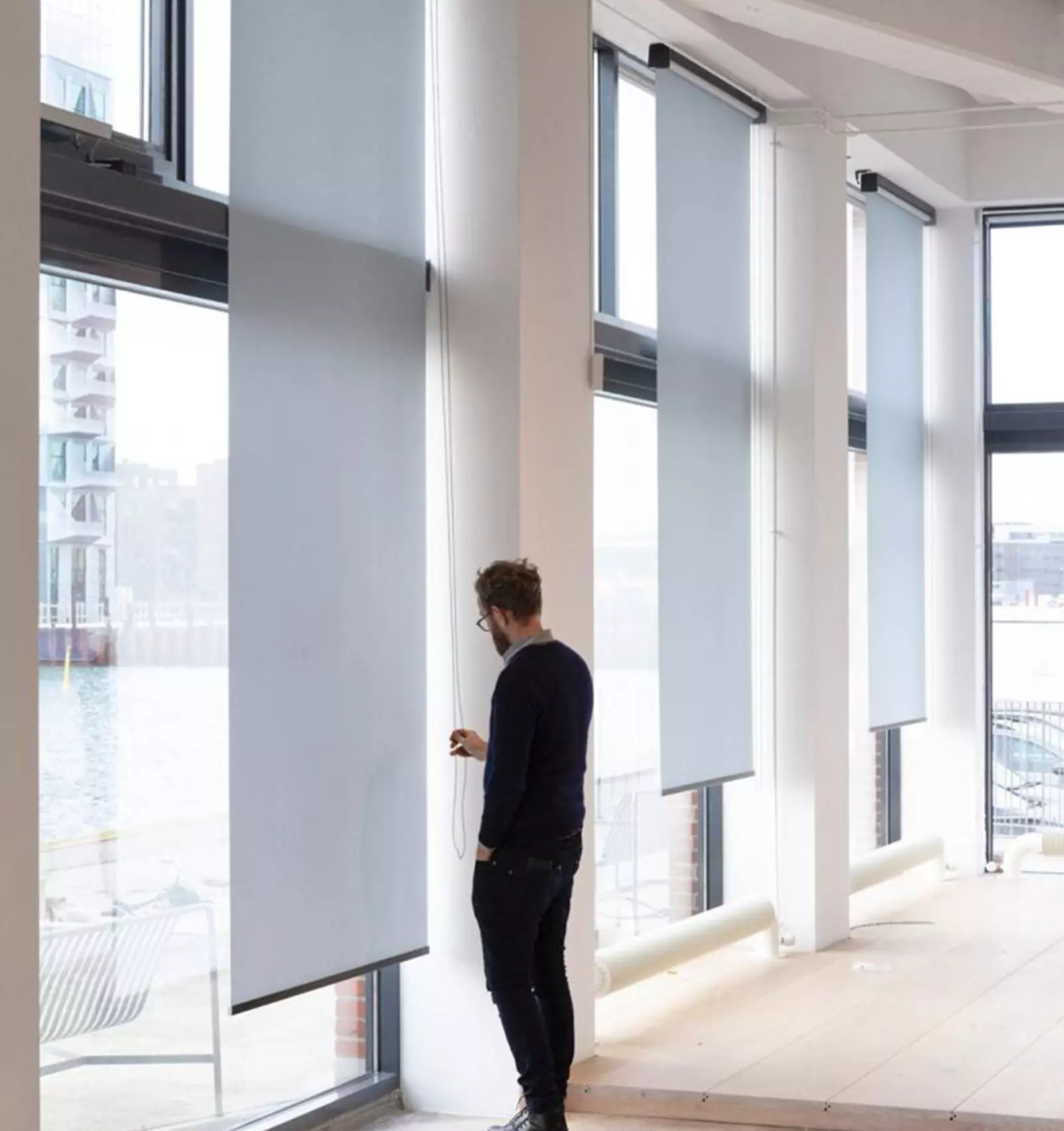
We have a range of products ideals to match your home decor. Select from our catalogue, we offer a wide range of blinds and curtains, which adapt to the architecture of any building. Whether in neutral or more colorful colors, our technical screens were designed for different functions: as blackout to full opacity, more aimed at bedrooms or other environments that need to be obscured. Our screens translucent were designed for privacy, but with light and screens screen with a greater or lesser degree of openness, they allow you to view the outside even with the screens closed. In a revolutionary style of light control and privacy in one, we have screens vision made with an opaque fabric strip, followed by a translucent one, which roll between themselves. 

Click on the images to enlarge
Easetep | Mosquito Nets, Roller Blinds and Vertical Blinds uses cookies. When browsing it you are in accordance with its use. Accept